I'm working on this year's auction quilt. The kids have designed the blocks and I have them laid out on point. I want to put more small squares in the border but I'm not sure how to lay them out. I have gotten a few opinions but I want more! Keep in mind that this quilt will be auctioned off along with a storybook and a bedtime story by the teacher. It's meant to be a large throw for a child. It will be approximately 60 inches wide and will have some white on the outside before the binding, which will be blue/green. I am going to try embroidering the school logo in the center square (and maybe in more depending on how much time that takes).
So, which do you like and why? Please leave comments! The samples are all up on a design wall, and some of the squares are temporarily stuck up there. So ignore any crooked squares, please.
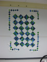
Asymmetrical border:
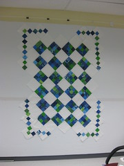
Symmetrical border:
Full border:
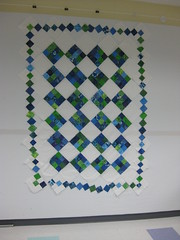
I'd like any and all feedback. Again, ignore the crookedness of the outside border, especially in the last photo. I was running late for my radiation appointment when I took it!
I like the asymmetrical border -- but, we both knew that before you asked ;-) I would make it reall asymmetrical and only do the 2 bigger corners, if you wanted another idea.
ReplyDeleteSeriously, they all look awesome!
Cheryl, I like the full border. To me, there is something about the symmetrical and asymmetrical versions that looks incomplete, like an element needs added somehow. I'm all about unconventional work, but to me, on this piece the full border, although more conventional, looks neat and complete...
ReplyDeleteOddly, I agree with Jennifer. I usually like things a little off but not this time. To be fair, it may be different in person. (This is Elizabeth... somehow I couldn't get my name.)
ReplyDeleteI like the asymmetrical one too. But you knew that already too. I like Michele's idea about make it look REAL asymmetrical.
ReplyDeleteI like the full border.
ReplyDeleteI like the asymetrical and the full border. But it looks great you really can't go wrong.
ReplyDeleteI like the full border. I, too, think the assymetrical/symmetrical borders look like they are missing something. If you wanted to personalize it even more...you could put a photo or two of the class in lieu of some of the white blocks, or maybe for a label on the back. I love these types of auction projects...what's the book going to be? --Deborah
ReplyDeleteThanks for the feedback so far! Deborah, I will put a label on the back for sure, explaining which block was done by which kid. We shy away from photos of the class because we want it to be not so personal that parents from other classes won't bid on it.
ReplyDeleteI like the Symmetrical border. the full border looks more "finished", but I like the openess of the Symmetrical border
ReplyDeletei love the colors and pattern - and my vote is for the full border.....i wish I could enter the auction!!
ReplyDeleteI think I like the asymetrical border. But i'm not really sure why - lol. I like the full border, but I think it needs something more....
ReplyDeleteKris